A human-first identity for an AI talent platform moving beyond traditional staffing
Company
SUPAHUMANS
Sector
AI talent platform
Stage
Repositioning
Year
2026
Company
SUPAHUMANS
Scope
Brand identity + strategy
Timeline
Mar – Apr 2026
Credit
Design by BrightStudios, led by Daniel G. Bright
01
The stakes
SUPAHUMANS was repositioning beyond traditional staffing. Its brand needed to explain the role of AI while keeping the people at the center of the offer.
02
The read
The product was in place and the company was mid-rebrand. We needed a clear point of view to connect the new name with the platform’s visual identity.
03
The move
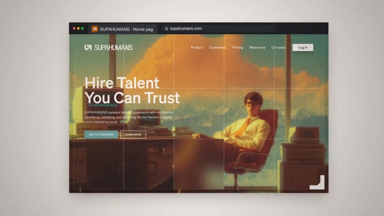
We built the strategy and identity around humans enhanced by AI, using that idea to guide the wordmark, color, typography and imagery.
04
The system
Brand strategy, positioning, visual identity and a logo system for the platform’s new direction.
Summary
SUPAHUMANS is an AI talent platform repositioning beyond traditional staffing. We developed the strategy and identity around humans enhanced by AI, giving the new name a clear point of view and a visual system to match.
Industry — SaaS, AI Talent Platform
Services — Brand Strategy, Brand Identity, Logo Design, Naming Review
Tools — Figma, Midjourney, Notion
Inflection point — New wedge, old brand
The Company
The company came to us during its rebrand from Assistant Lee to SUPAHUMANS. The product was already in place; our role was to define how the new brand would present its people, capabilities and use of AI.
The Problem
The visual direction needed to make the role of people clear. Familiar AI imagery, such as augmented portraits and abstract grids, gave us little room to explain what was specific to SUPAHUMANS.
We focused the identity on the relationship between human capability and AI. That gave the team a practical basis for evaluating imagery, typography and the logo.
The Decision
Humans enhanced by AI became the organizing idea. We used it to set a human-first direction for the brand, with the name and visual language expressing capability together.
The visual review ruled out floating-head portraits, blue lights at the temple and abstract grid backgrounds. The new wordmark and color direction were developed to support the SUPAHUMANS name.
The System
The work connected the platform’s positioning with a reusable identity system:
Brand strategy: positioning, narrative, and category point of view
Brand identity: logo, wordmark, typography system, and color
Visual identity system applied across key surfaces
One idea across the identity
The human-first idea gives the team a clear reference for future brand decisions. It connects what SUPAHUMANS offers with how the platform presents itself across its key touchpoints.
Credits — Strategy, Design: Daniel G. Bright, BrightStudios®


More case studies


Let’s look at your product next
If your product has a similar problem, book a call and we’ll tell you which scope would fit.